Branding
Print Assets
Web Design
Photography

The brief
HBR is seeking to produce a short animated infographic for the article “Building Healthy Habits When You’re Truly Exhausted” written by Author Elizabeth Grace Saunders to be featured on their YouTube channel.
The goal is to make the messages in
the article clearly communicated and also appeal to their primary audience.
visual cues
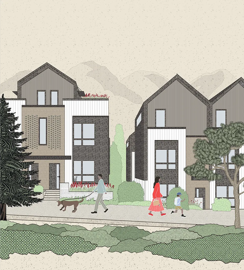
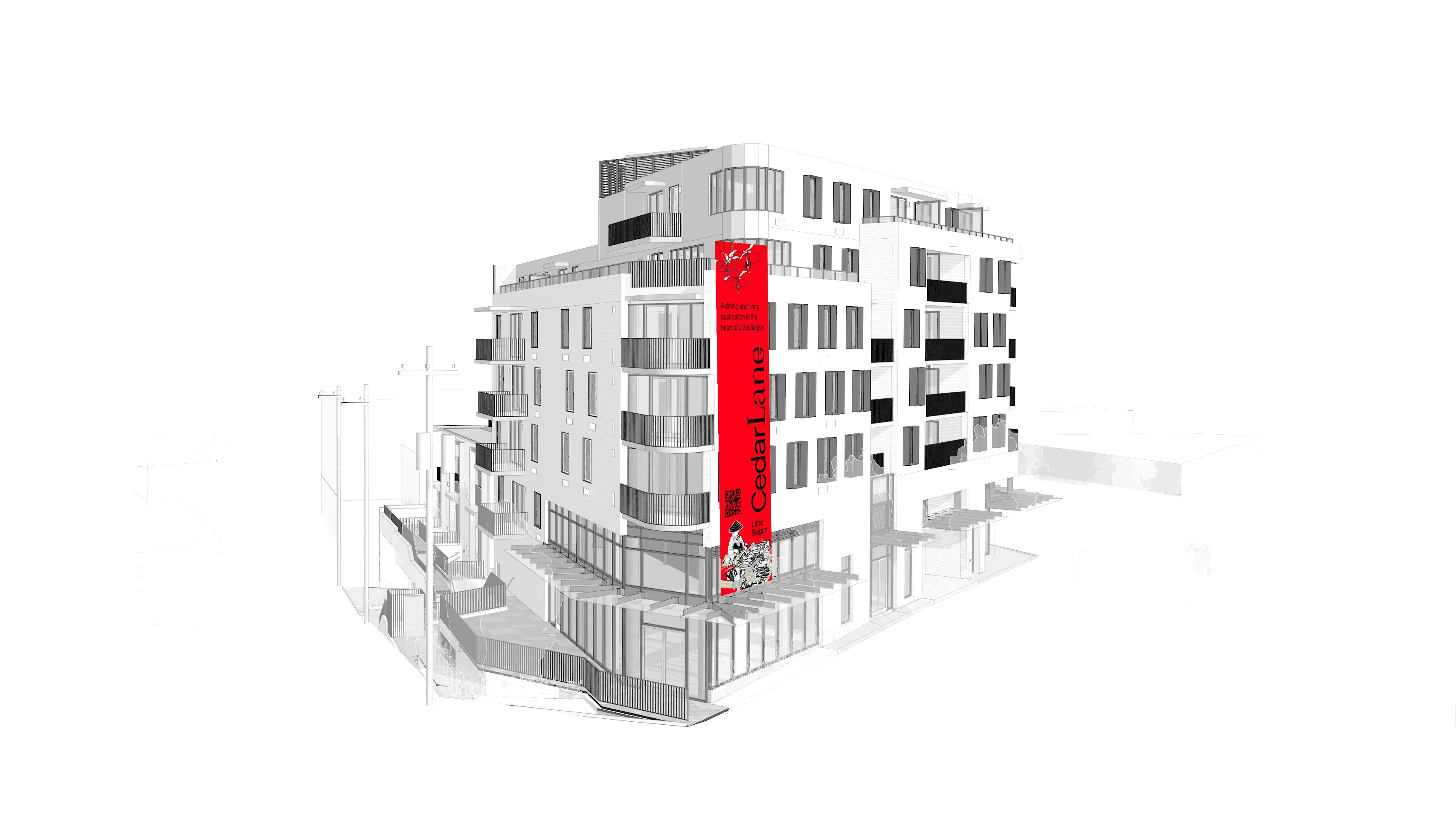
Brand Strategy — A Vertical Village on Kingsway
From the outset, the branding process was rooted in listening. Before any design decisions were made, time was spent understanding the cultural and social fabric of what is known as Little Saigon in Vancouver—a stretch of neighbourhood generally between Fraser Street and Knight Street—exploring its rhythms, rituals, and visual cues. Through a community consultation and conversations with local business owners, including Cathy from Kim Chau Deli, we gained insight into how residents experience the neighbourhood as a welcoming home evolved from multiple generations.
What emerged was a powerful idea: a merging of east meets west. CedarLane is not just a building—it is a vertical village.
The brand needed to resonate with two audiences at once: long-standing residents who have shaped the area for decades, and a younger demographic seeking modern, community-driven urban living. Rather than leaning into trend-driven real estate aesthetics, the identity was designed to feel embedded—familiar yet forward-looking.
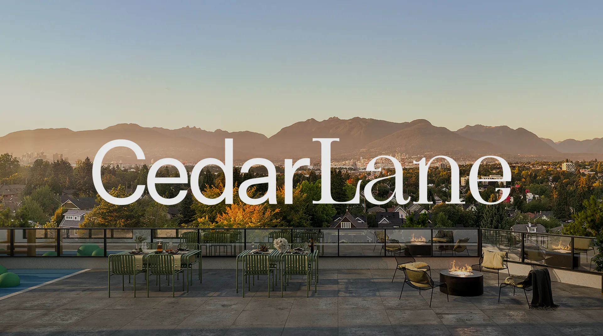
Heritage Interpreted through a contemporary lens The resulting identity is distinctive without being loud, expressive without being exclusive—designed to sit comfortably within the streetscape while still standing apart.
The visual system draws inspiration from everyday Vietnamese design language: rice hats glimpsed in storefronts, ochna blossoms associated with celebration and renewal, and the glow of neon signage reflected in café windows after dusk. These references were not treated literally, but abstracted—translated into shape, colour, rhythm, and texture.
The palette balances warm neutrals and stone greys with expressive accents of ochna yellow and vermilion red, echoing the vibrancy of Tết and the lively storefronts that line Kingsway. Typography was selected to feel modern and confident while remaining welcoming—supporting a brand voice that is both grounded and optimistic.